Inserting a Table
There are two ways of inserting a table into the editor window, and both have the same effect. Choose your preference.
Toolbar Menu Item
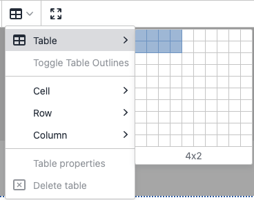
Place your cursor in the location the new table should be inserted and select the table icon in the toolbar. Hover over the Table item in the resultant menu. A grid will appear from which you can choose the number of table rows and columns to insert.
Context Menu
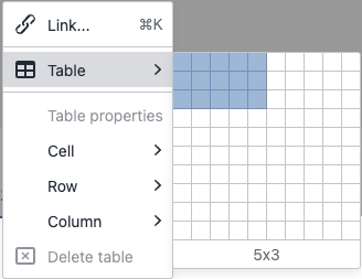
Right click in the location the new table should be inserted to open the context menu. Hover over the Table item in the resultant menu. A grid will appear from which you can choose the number of table rows and columns to insert.
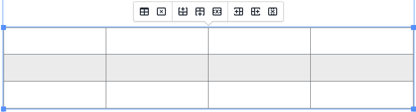
The table inserted into the editor will look like the image below:
Style Specifications
Tables on our site's webpages maintain a uniform style to strengthen our brand. Odd numbered rows have a white background, and even numbered rows have a light grey background to help distinguish visually between content in each row. On desktop, a user can hover over a table row to highlight it, changing the backgorund color to a pale blue. Header rows and cells as well as Footer rows are visually distinguished by a dark blue background with white text.
Basic Table Modification
The actions for basic table modification can be found in three different places: The Toolbar, the table's Pop-up Menu, and the table's Context Menu. These menus all contain the same basic actions, shown here:
-
Table Properties
Opens the Table Properties dialog. The only two properties that are supported by your Web Team in this dialog are the Class and Custom Class fields. The other fields should not be used at all. The supported properties however, should generally only be used by site administrators on the Web Team. -
Delete Table
Deletes the table and its contents. -
Add Row Above
Adds a row above the row in which the cursor is positioned. -
Add Row Below
Adds a row below the row in which the cursor is positioned. -
Delete Row
Deletes the row in which the cursor is positioned, as well as all of that row's contents. -
Add Column Left
Adds a column to the left of the column in which the cursor is positioned. -
Add Column Right
Adds a column to the right of the column in which the cursor is positioned.
-
Delete Column
Deletes the row in which the cursor is positioned, as well as all of that row's contents.
Table Toolbar Menu
Click within an existing table to focus it (a blue border around the table visually indicates focus). Click the table icon in the editor's toolbar to open the Table Menu:
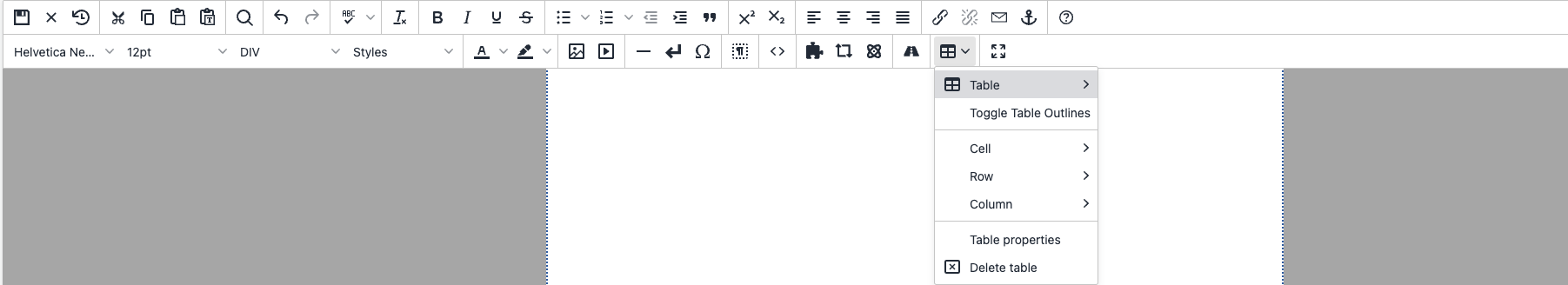
You will find that all of the actions listed at the start of this section (above) are present in this menu.
Table Context Menu
Click within an existing table to focus it (a blue border around the table visually indicates focus). Right click to open the context menu. If you used the context menu to create a table earlier, you will notice the difference. In this case, a table is focused, so the context menu has the 'Table Properties' and 'Delete Table' options enabled. The submenus Cell, Row, and Column also have their menu items enabled. These items were disabled outside of the table context. You will find that all of the actions listed at the start of this section (above) are present in this menu.
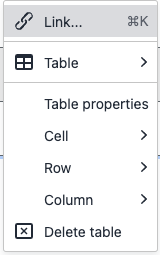
Table Pop-up Menu
Click within an existing table to focus it (a blue border around the table visually indicates focus). You should see a pop-up menu that looks like this:
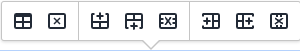
The buttons in the Table Pop-up Menu contain no text, only icons. You will find that all of the actions listed at the start of this section (above) are present in this menu, from right-to-left. I find this menu to be the most convenient for quick table actions, but you will find that there are no advanced table modification actions in this menu.
Advanced Table Modification
The actions for basic table modification can be found in two different places: The Toolbar and the table's Context Menu. These menus contain the same advanced actions, detailed below.
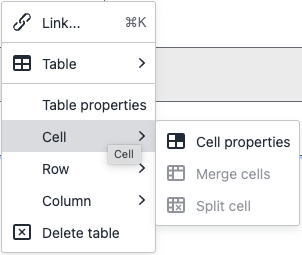
Cell Menu
The cell menu is available from both the table's context menu, and the toolbar when in the context of a table. It contains 3 menu items: Cell Properties, Merge Cells, and Split Cell. The Cell Properties item is always active in the context of a table, but Merge Cells and Split Cell are disabled unless the context is right for them to be enabled.
Cell Properties
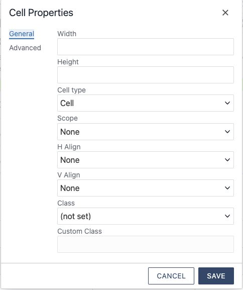 The Cell Properties menu item opens up the Cell Properties dialog to the General Tab.
We will not be covering the Advanced tab. None of the settings in the Advanced tab
are supported by your Web Team, and we discourage their use. This also goes for the
following fields in the General tab of the Cell Properties dialog: H Align and V Align.
Width and Height should be used sparingly, our tables are responsive enough to handle
these things automatically.
The Cell Properties menu item opens up the Cell Properties dialog to the General Tab.
We will not be covering the Advanced tab. None of the settings in the Advanced tab
are supported by your Web Team, and we discourage their use. This also goes for the
following fields in the General tab of the Cell Properties dialog: H Align and V Align.
Width and Height should be used sparingly, our tables are responsive enough to handle
these things automatically.
Cell Type
Allows this cell to be changed between a Header Cell and a regular Cell. Header cells will be blue with white text, and will be automatically scoped if they are in the top row or the far-left column.
Scope
This setting only applies to header cells. Scope indicates whether a header cell is meant as a header for the row it is in, or the column that it is in. Scoping is handled automatically for headings in the top row, and far-left column. The only times you will need to manually scope a header cell is when:
- The cell is not in the top row or far-left column.
- The cell is in the top row AND far-left column. In other words, it is the furthest top-left cell in the table. This cell defaults to the Column scope, but can be set manually in the case that it is meant to be a Row heading.
Class and Custom Class
This sets a CSS class on the table cell. Don't use this unless you know what you're doing. In most cases, this is only used if the table you are editing is a Column Layout or other type of snippet. The Custom Class field is disabled unless you set the Class dropdown to '(custom)', in which case you can add a list of space-separated classes.
Merge Cells
This action merges multiple cells into a single cell. This menu item is only active when multiple cells are selected at once. You can select multiple cells at once by clicking and dragging vertically or horizontally to highlight mulitple cells in a row or column. Please note that merging cells makes tables difficult to understand for site visitors that use a screenreader. There few cases where it makes sense for this to be done, but it is generally discouraged.
Split Cells
This action splits any cells that have been merged, returning them to their original state. This menu item is only active when a merged cell (a cell that spans multiple rows or columns) is focused. Click within a cell to focus it. The cursor blinking within a cell is a visual indication that the cell is focused.
Row Menu
The row menu is available from both the table's context menu, and the toolbar when in the context of a table. It contains 8 menu items: Insert row before, Insert row after, Delete row, Row properties, Cut row, Copy row, Paste row before, and Paste row after.
Simple Row Operations (Insert row before, Insert row after, and Delete row)
These menu items perform the basic row operations stated in their labels to the row that is focused. Click within a cell to focus the cell and the row that the cell is in. The cursor blinking within a cell is a visual indication that the cell and its row are focused. Newly inserted rows will have the same arrangement of header cells, footer cells, and body cells as the row that is focused when the insertion takes place.
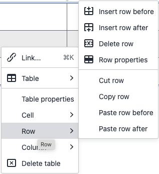
Row Properties
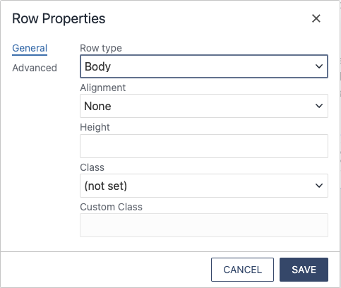 The Row Properties menu item opens up the Row Properties dialog to the General Tab.
We will not be covering the Advanced tab. None of the settings in the Advanced tab
are supported by your Web Team, and we discourage their use. This also goes for the
following fields in the General tab: Height, Class, Custom Class.
The Row Properties menu item opens up the Row Properties dialog to the General Tab.
We will not be covering the Advanced tab. None of the settings in the Advanced tab
are supported by your Web Team, and we discourage their use. This also goes for the
following fields in the General tab: Height, Class, Custom Class.
Row Type
Allows the entire row to be changed between a Body row, a Header row, and a Footer row. A Header row will always display at the top of the table regardless of its original placement, and a Footer row will always display at the bottom of the table regardless of its original placement. Both Header and Footer rows will be dark blue with white text. Making a row into a Header row helps communicate visually and to screen readers that the row contains column headings. Making a row into a Footer row helps communicate visually and to screen readers that the row contains summary information of the table like column totals or averages. Setting a row type as Header or Footer cannot be overridden by individual cells in a given row, e.g. if a header row contains a regular cell, that cell will still look and function like a header cell because it is in a header row (same goes for footer rows). However, in Body rows with individual cells set as Header Cells, the Cell setting takes precedence.
Alignment
Sets the justification of all cells in the row. This setting will be overridden by the text justification buttons in the toolbar, but is a good way to affect multiple cells at once.
Advanced Row Operations (Cut row, Copy row, Paste row before, and Paste row after)
These menu items perform the more advanced row operations stated in their labels to the row that is focused. Click within a cell to focus the cell and the row that the cell is in. The cursor blinking within a cell is a visual indication that the cell and its row are focused. Copying or cutting a row creates a special clipboard separate from the regular text clipboard. You can only paste a row from this special clipboard using the Paste row before, and Paste row after menu items.
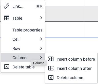
Column Menu
The column menu is available from both the table's context menu, and the toolbar when in the context of a table. It contains 3 menu items: Insert column before, Insert column after, Delete column.
Simple Column Operations (Insert column before, Insert column after, and Delete column)
These menu items perform the basic column operations stated in their labels to the column that is focused. Click within a cell to focus the cell and the column that the cell is in. The cursor blinking within a cell is a visual indication that the cell and its column are focused. Newly inserted columns will have the same arrangement of header cells, footer cells, and body cells as the column that is focused when the insertion takes place.
Column Properties
There is no column properties dialog available in the column menu like there are for Cell Properties and Row Properties, however we can still affect an entire column at once. You can select multiple cells at once by clicking and dragging vertically or horizontally to highlight mulitple cells in a row or column. Once multiple cells are selected, you can go to the Cell Properties option in the menu and change settings for all the cells selected. A common use case for this is selecting the entire left column and going to Cell Properties->Cell Type->Header cell to create a header column. This is alot easier than changing each cell in the column individually. You can even set each selected cell to have the same class in this way. An important issue with this process is if the selected cells all have different values in the Custom Class field. In this case, the Custom class must be set for each cell individually.
Example Tables
The following examples are for visual comparison between the various combinations of header cells, header rows, and footer rows most likely to be used.