A column layout allows us to display content side-by-side. There are a few prefabricated snippets to get you started with simple column layouts, but the editor is flexible enough to allow many more complex layout options for web-editors that need finer control.
Available Column Layout Snippets
In this section we demo all 5 of the prefabricated 'Column Layout' snippets available. These snippets are available to plug-and-play, meaning that once they are inserted, you can save your page and call it a day (after customizing its content of course)! Read on to learn how to create a simple Column Layout.
Example: 2 Column Layout
col-md-6
Lorem ipsum dolor sit amet, consectetuer adipiscing elit.
col-md-6
Lorem ipsum dolor sit amet, consectetuer adipiscing elit.
Example: 3 Column Layout
col-md-4
Lorem ipsum dolor sit amet, consectetuer adipiscing elit.
col-md-4
Lorem ipsum dolor sit amet, consectetuer adipiscing elit.
col-md-4
Lorem ipsum dolor sit amet, consectetuer adipiscing elit.
Example: 4 Column Layout
col-md-3
Lorem ipsum dolor sit amet, consectetuer adipiscing elit.
col-md-3
Lorem ipsum dolor sit amet, consectetuer adipiscing elit.
col-md-3
Lorem ipsum dolor sit amet, consectetuer adipiscing elit.
col-md-3
Lorem ipsum dolor sit amet, consectetuer adipiscing elit.
Example: 2 Column Layout (Wide Left)
col-md-9
Lorem ipsum dolor sit amet, consectetuer adipiscing elit.
col-md-3
Lorem ipsum dolor sit amet, consectetuer adipiscing elit.
Example: 2 Column Layout (Wide Right)
col-md-3
Lorem ipsum dolor sit amet, consectetuer adipiscing elit.
col-md-9
Lorem ipsum dolor sit amet, consectetuer adipiscing elit.
Creating a Simple Column Layout
If you are looking to get started with a column layout that doesn't need too much customization, you're in the right place. This section reviews how to create a column layout snippet with custom content. Read on to learn how to create a complex Column Layout.
Procedure
- In the snippets chooser, filter to the 'Column Layouts' category, or search the word 'column'. Choose from
the available 'Column Layout' snippets and insert the one you want.
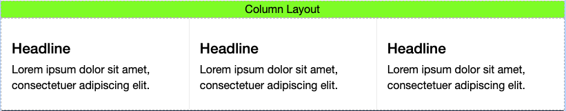
- In the example image (above), we have inserted a '3 Column Layout', delineated by the lime-green caption 'Column Layout'. Each column contains dummy data that you will replace with your own content.
- Replace the Headline and lorem ipsum dummy content with your own content.
- Make sure to test that this layout looks the way you want on mobile!
Creating a Complex (Custom) Column Layout
This more advanced tutorial is for web-editors that need finer control over the width and number of columns in their Column Layouts. This tutorial assumes you already have experience with or understanding of how to use the editor's Table Tool. Before we start, let's take a moment to talk about Bootstrap and CSS. We use a CSS Framework called Bootstrap v3.4 on our website which provides us with the CSS classes used to build our column layouts. Each column in our prefabricated layouts (above) has a class that starts with 'col-md-' and ends with a number between 1 and 12. On desktop displays, col-md-12 is full or 100% width, and col-md-1 is 1/12 or 8.3% width, there are many combinations of column count and width available In a single row. This can be extended even further by nesting Column Layouts within each other.
Example
col-md-6
col-md-6
col-md-3
col-md-5
col-md-7
col-md-4
col-md-8
Procedure
- Insert a simple 'Column Layout' snippet as above, but don't optimize for mobile just yet (wait until step 5 of this procedure).
- Edit the table to make sure it has the number of rows and columns you want. Note that adding columns
to the table will look wonky at first (see image), but continue to follow to the next
step.
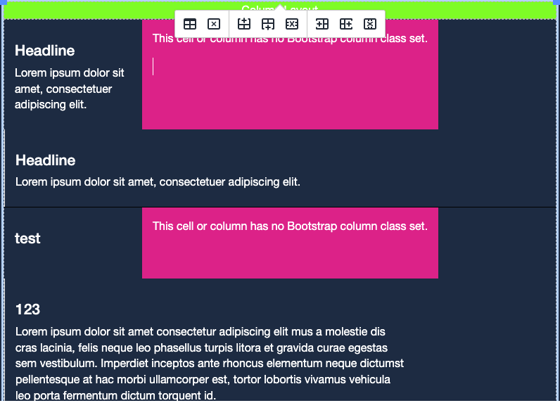
- In the image above, I had a '2 Column Layout (Wide Right)' snippet and added a column in the middle of the two existing columns. Notice that the new column is pink, and each of its cells have the following error: 'This cell or column has no Bootstrap class set'. This is because the broken cells have no CSS class set in their Cell Properties. The newly added cells also force elements in the same row to wrap, because we have yet to shrink the other cells in the same row to make space for the new cell.
- To fix the broken cells, Edit the Cell Properties of each new and existing cell (or column), changing the number portion of the "Custom Class" field
to the width that the column should take up (out of 12). Think of 12 as 100% width,
and whichever number you use will be a proportion of that width out of 12. So, cells
with the class 'col-md-6' will be 6/12 or 50% width, 'col-md-2' will be 2/12 or about
17% width, etc.
- In the example image above, our existing columns had the classes 'col-md-9' and 'col-md-3' respectively. To prevent wrapping when adding a new column, we need the existing columns to have lower numbered classes to make room, and for the new (pink) column to have a class added. All classes in the row should add up to 12.
- Remember that you can update the Cell Properties of an entire column by highlighting that column and then accessing the editor's Table Tool.
- Note that in a layout with multiple rows (like the example image above), there must be an equal number of columns in each row. To circumvent this requirement, try nesting layouts. Multiple rows are used to show a clean horizontal rule between each column.
- In working with the Cell Properties of each column, you may notice some that have a secondary CSS class, 'devider'. Columns with this class have a vertical rule to their left, visually separating the columns. Note that the leftmost column of each Column Layout snippet does not have this class (because there are no columns to the left of it), but every other column does.
- Make sure to test that this layout looks the way you want on mobile!