To ensure a Column Layout looks as good on mobile as it does on desktop and vice versa, some extra consideration must be taken before our pages are ready to be published. In this help section, we review the default breakpoint at which columns will wrap, and explain customizations web editors can use to finely tune the layout that site vistors will experience on various devices.

Available Breakpoints
A breakpoint is a range of widths (in pixels) that devices screens or browser windows fall into. The framework our site uses, Bootstrap 3.4, bases its grid breakpoints on minimum width media queries, meaning they apply to that one breakpoint and all those above it. This framework has the following 4 breakpoints:
xs (Extra Small)
0-767px, i.e. Smartphones

sm (Small)
768-991px, i.e. Tablets

md (Medium)
992-1199px, i.e. Laptops

This is the default breakpoint for the columns in all Column Layout snippets.
lg (Large)
>1199px, i.e. Desktop computers

Testing
Testing a page on 4 different devices can get cumbersome. Luckily, you can do it all from your computer! Most modern browsers have a built-in way to simulate what a layout looks like on different devices.
Easy Device Simulating Guides
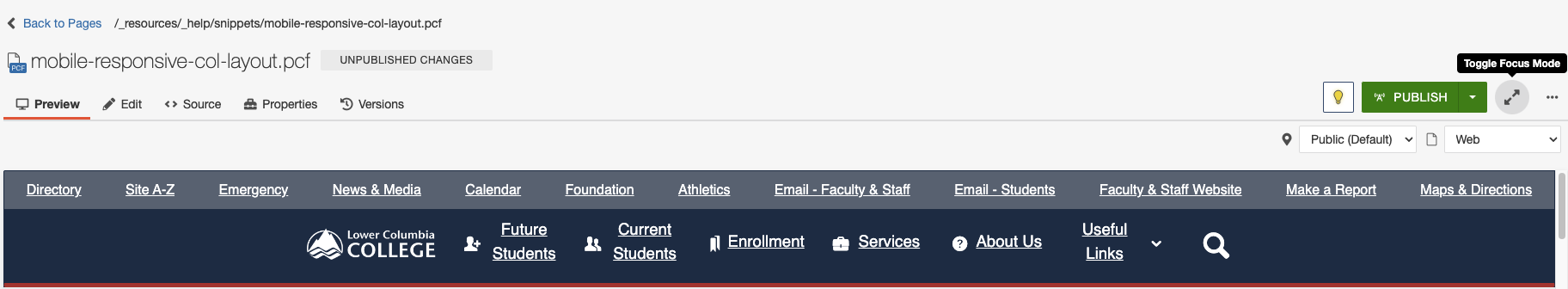
You can use these device simulators from staging mode as well, to ensure your layout looks right at all breakpoints before you publish your page. Since the preview window in Omni CMS is small, try the "Toggle Focus Mode" button next to the publish button to view your preview at the correct scale (see image).
Responsive Example
Resize your browser window to test the example columns below to see these responsive Bootstrap classes in action, and to get an idea of how you might use them for your own tailored layouts. Be sure to test the different breakpoints the easy way, using device simulation!
This column has the following classes:
- col-lg-9
- In windows that are 1200px wide or greater, this column will be 9/12 (75%) the width of the screen.
- col-md-6
- In windows that are between 992 and 1199px wide, this column will be 6/12 (50%) the width of the screen.
- col-sm-3
- In windows that are between 768 and 991px wide, this column will be 3/12 (25%) the width of the screen.
- Note that on windows less that 768px in width, this column will display as 12/12 (100%) width, forcing the next column to wrap.
This column has the following classes:
- col-lg-3
- In windows that are 1200px wide or greater, this column will be 3/12 (25%) the width of the screen.
- col-md-6
- In windows that are between 992 and 1199px wide, this column will be 6/12 (50%) the width of the screen.
- col-sm-9
- In windows that are between 768 and 991px wide, this column will be 9/12 (75%) the width of the screen.
- Note that on windows less that 768px in width, this column will display as 12/12 (100%) width.